Brand and Corporate Identity, Packaging Design
Staropramen packaging design & visual brand identity
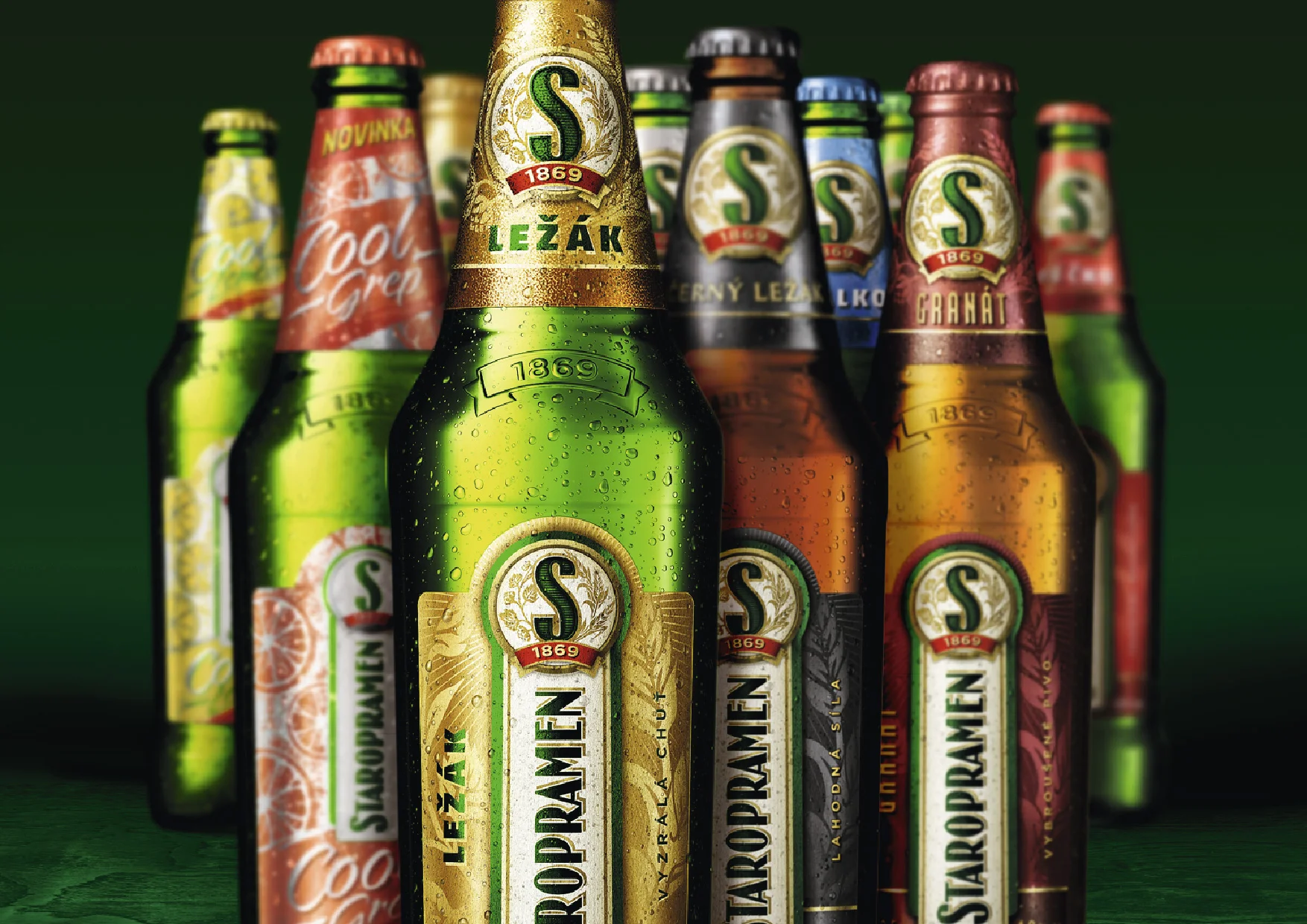
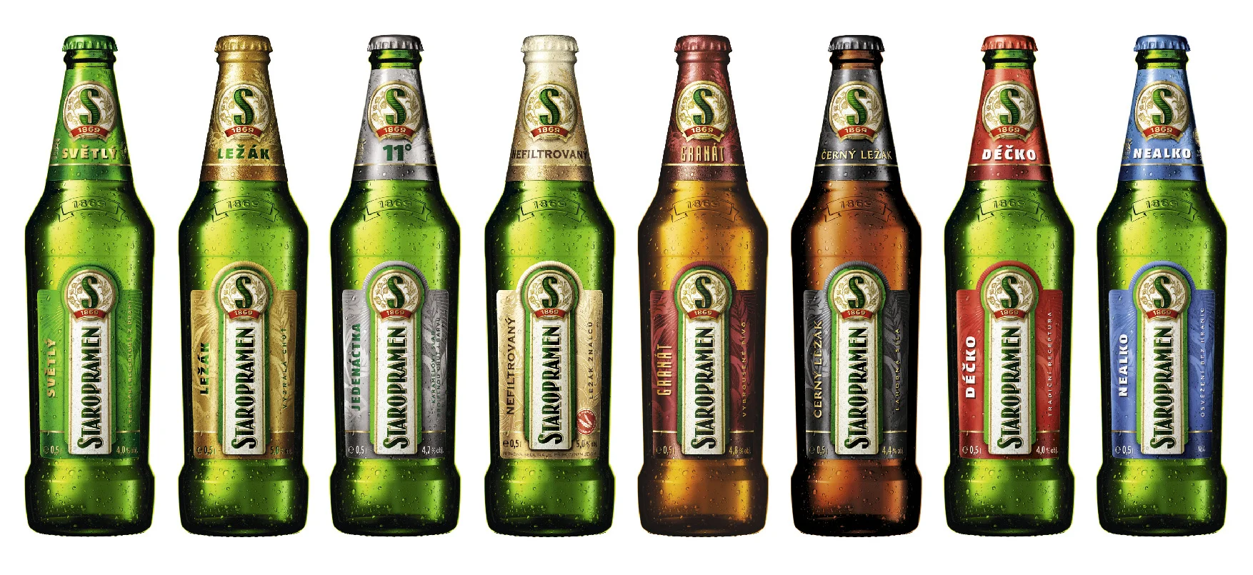
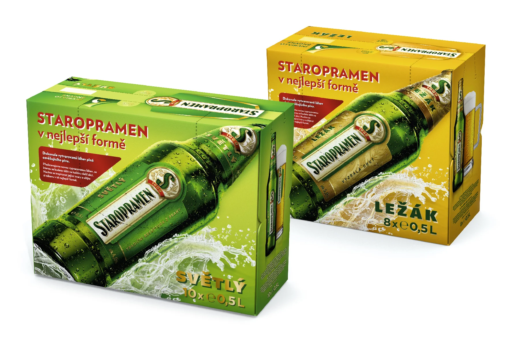
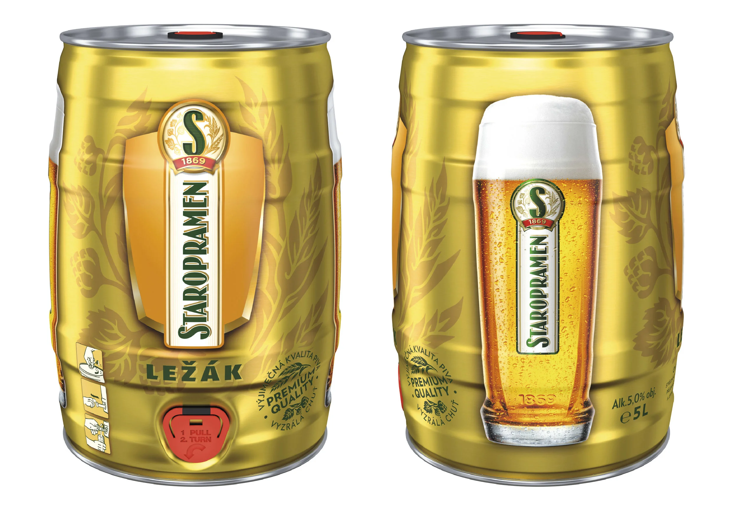
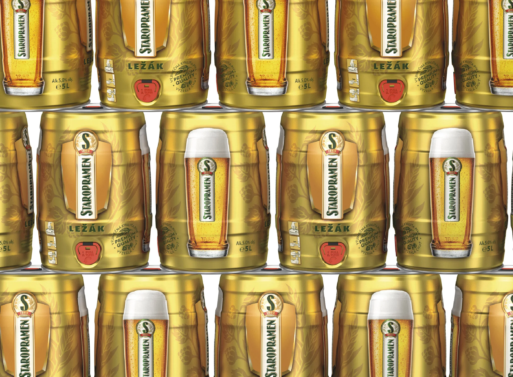
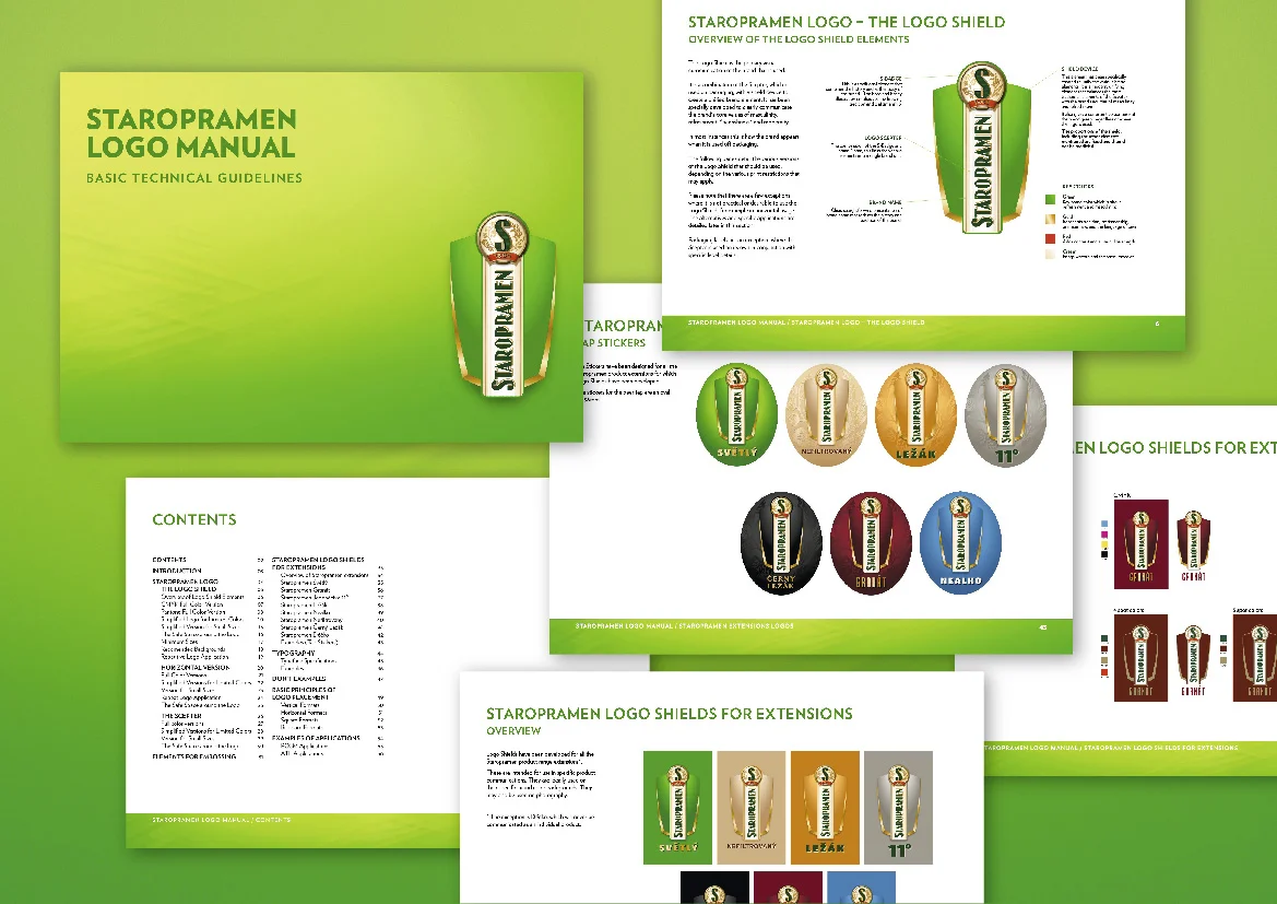
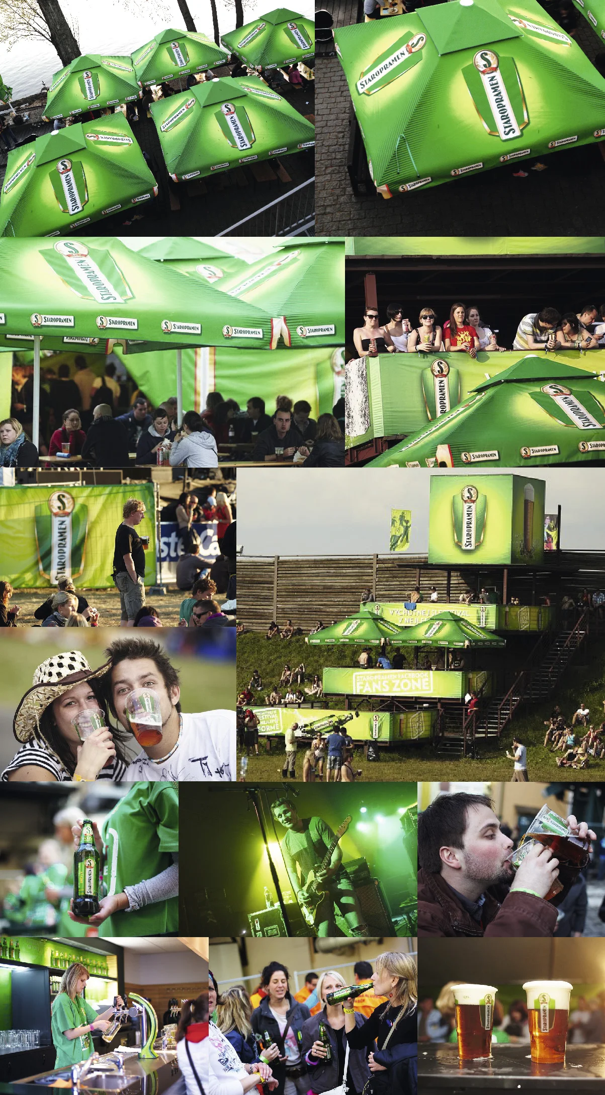
Redesign of whole beer range of Staropramen brand for Domestic market (CZ and SK). It includes about 11 varieties of beer and different types of package (glass and PET bottles, aluminum can, multipacks, mini-keg, crate).
Few categories are as difficult to design for as Beer in Central and Eastern Europe. These very conservative markets demand a relatively strict adherence to established category codes and traditional cues. Nevertheless, the most forward thinking brands push hard against these restrictions in order to differentiate themselves and create shelf impact and buzz in these very, very crowded markets.
The recent re-design of Staropramen represents the latest attempt by Staropramen to move the category forward – cleaning up cluttered labels, updating established brand cues, and using consumer insight to build a brand which speaks to the needs of their target audience.
Based on the insight that male and female roles are changing and that traditional masculine cues are becoming dated and relevant for fewer and fewer beer drinking males, Cocoon Group felt that there was an opportunity for a larger than normal shift in brand-thinking. We therefore developed the big idea 'Refresh your sense of Masculinity' – which we used as a basis for further development of the brand.
So while the Staropramen brand is still very much about young men having fun in traditionally masculine settings and situations, there is room for a less primitive approach –where masculinity is not overshadowed by 'dumb jock-ness'.
In seeking to 'refresh your sense of masculinity' the CG design team looked to bring three main ideas into the identity of the brand. They wanted to create much more of a 'Badge Brand' for Staropramen. They also wanted to find ways to bring tactile expression into the brand – expressing values not only through design elements, but utilizing other senses. Finally, the design team wanted to be sure not to lose the craftsmanship and heritage that already come with the prestigious Staropramen brand.
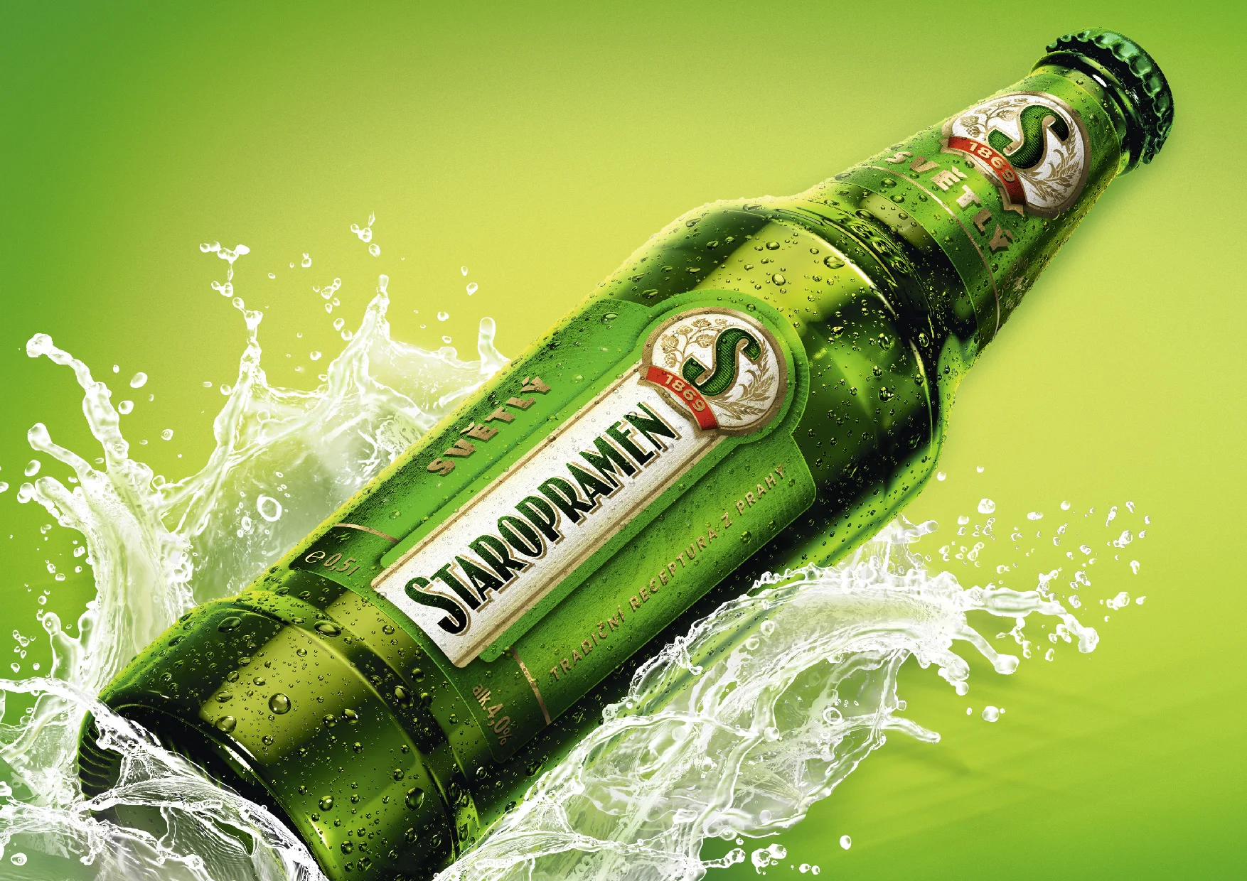
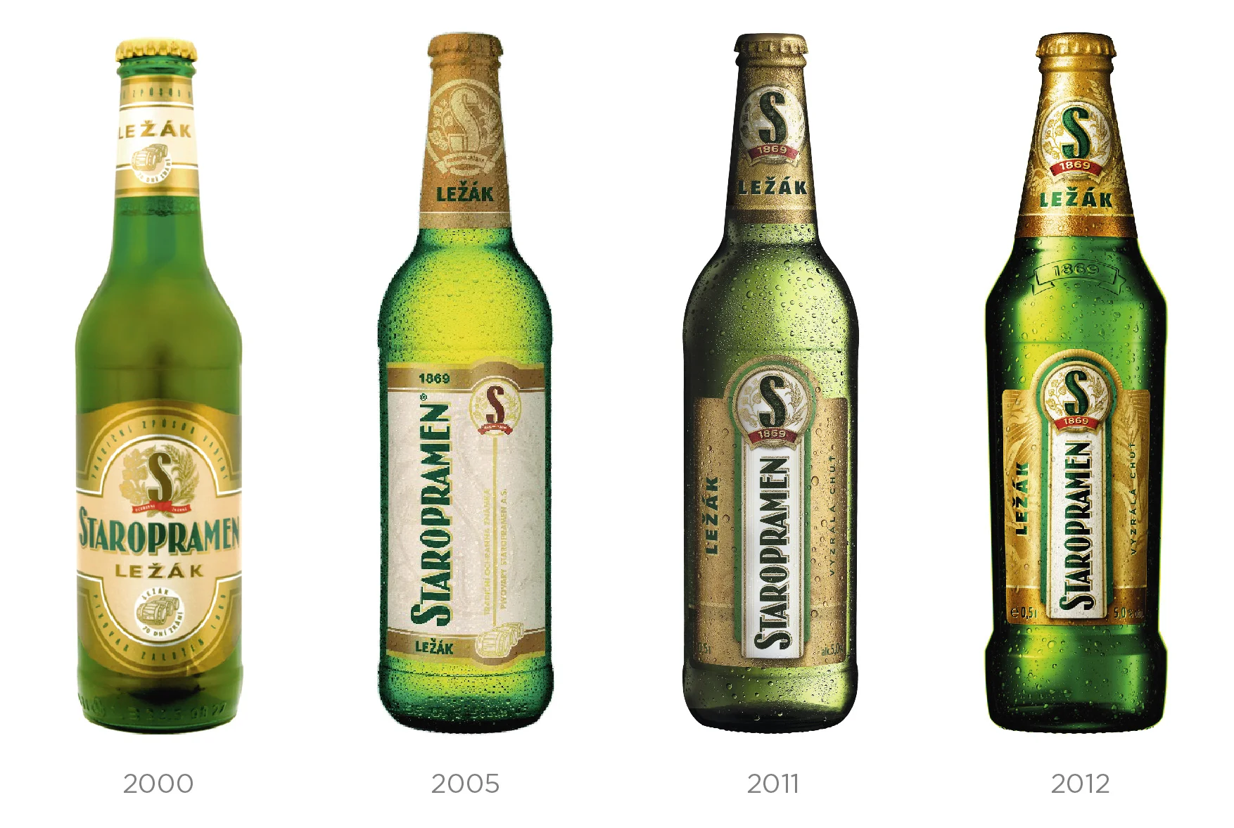
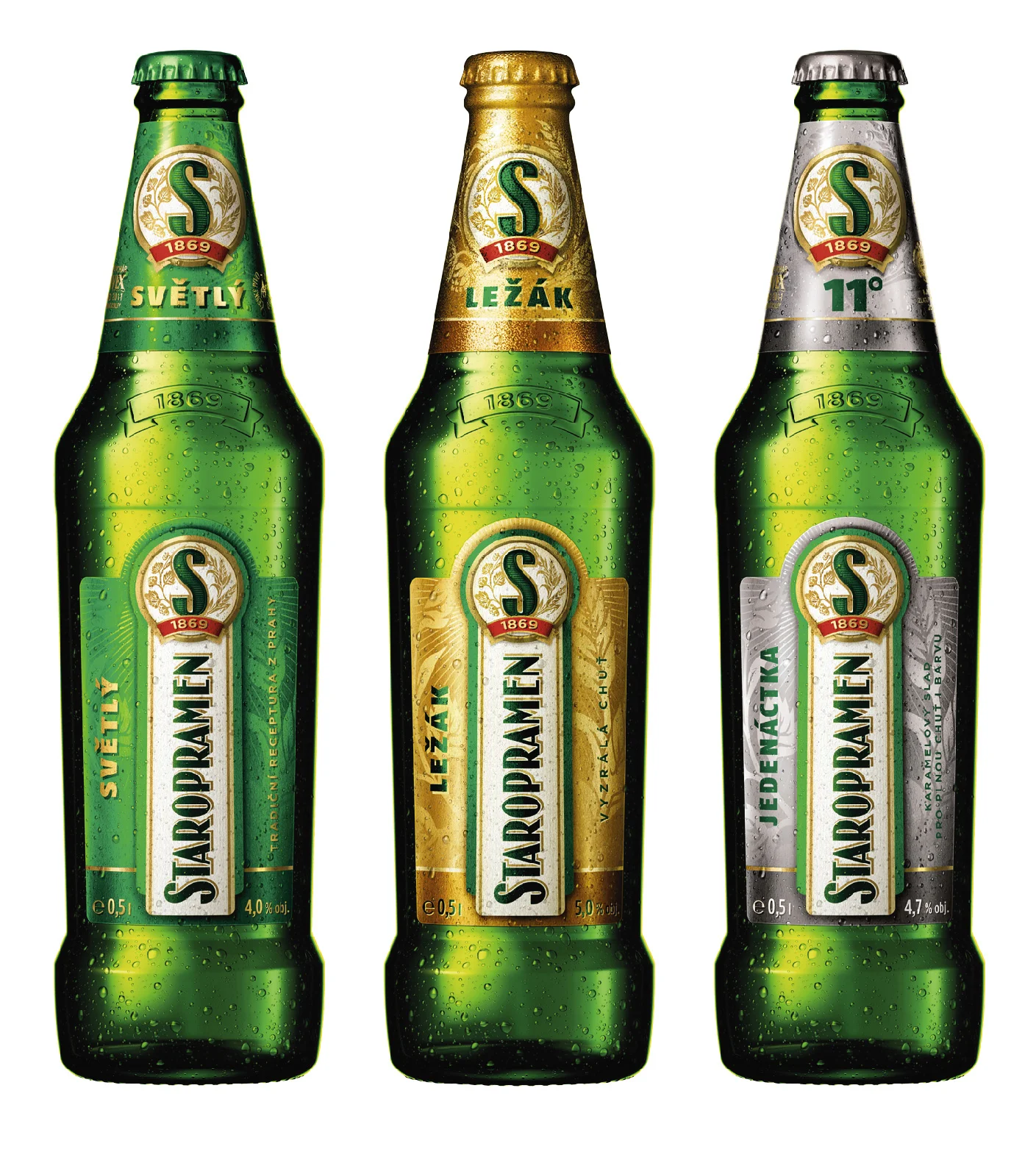
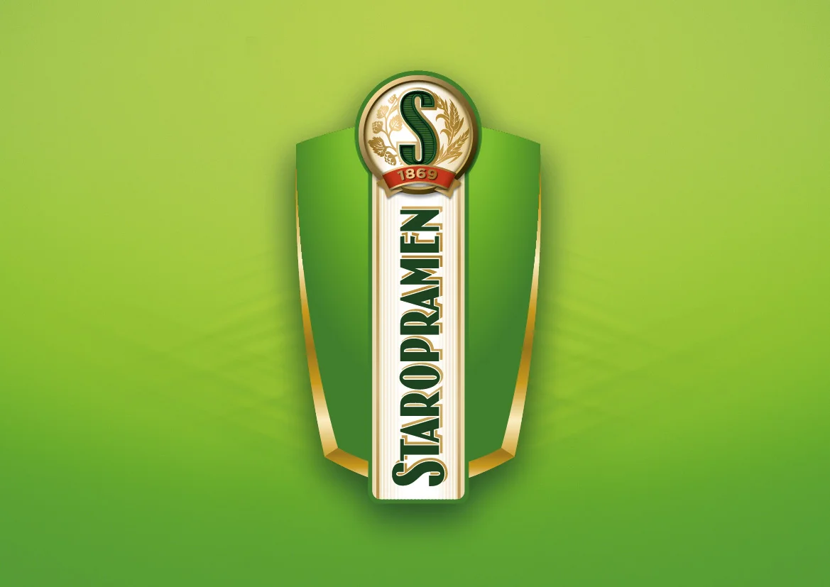
The final identity, as expressed mainly on packaging, uses a number of 2D and 3D enhancements. The use of a vertical label – already a bold step pioneered by Staropramen years ago (and copied countless times since), is continued here and made even more powerful by the use of the 'S' as a bold new mark, or badge, for the brand. Whereas the logomark on the old brand was shunted to the side, it now takes center stage. The brand name and mark become true heroes of the brand. Many of the quality cues which before cluttered the design have now been migrated to the bottle itself in a series of embossments and a new structure which is both distinctive and bold.
Off the pack, the brand block is now much cleaner and more modern, with stylish and flexible shape device. Indeed this is brand refreshes your sense of what a beer brand should look like!
After the development of the basic brand, CG also worked to develop a number of additional SKUs (11 in all) and the identity manual for the brand.
The new design of Staropramen successfully navigates the tightrope between category mandatories and envelope pushing. The success of this approach is already evident in increased sales across the nation.
Client: Molson Coors CZ / Pivovary Staropramen
Agency: Cocoon Group